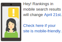
 Today is the day when Google has started implementing mobile friendliness as a search engine ranking factor. The actual announcement in this regard was done two months ago in the official WebMasterCentral blog. It also started showing a tiny warning in the official blog since then. If you use WordPress and if your site is not mobile friendly, yet, there are options to convert it (for free) to fit into mobiles nicely.
Bing considers mobile friendliness as an important factor on its search engine rankings too.
Hey wait… How can one check if the site is mobile friendly? My site already works fine on mobiles. I don’t see anything wrong in it. Why would I read the article any further?
While you may consider your site working fine on a mobile, it doesn’t mean, everyone else thinks so. For example,
- Does your site use flash? (flash plugin may not be available in all the mobile browsers)
- Does a user have to scroll horizontally to view content of your site?
- Do clickable items (links, buttons, etc) have enough gap between them?
- Is your site legible on mobile?
These are some of the factors that a common user considers unconsciously before considering your site as mobile friendly. So, Google and Bing defined some guidelines to make your site mobile friendly. Here are those. Choose what fits well for your site’s particular use case.
Domain Switching
A general advise is to use a separate URL, such as, m.yourawesomesite.com (or mobile.yourawesomesite.com) to serve different content just for mobile. However, with WordPress, still there is no easier way to do this. It is probably the thing of the past (hey: FB still uses it), when (old) browsers could not handle media queries correctly on mobiles. It is also bad for sharing (have you ever tried to share a FB URL to desktop users?).
If you are still interested in this approach, check out the available options.
Responsive Design
There are over 1000 free themes available in WordPress official repository that has responsive layout. Almost every commercial theme now comes with responsive layout.
Mobile theme using a Plugin
If your existing theme doesn’t have a mobile friendly design, there is a plugin to convert it to work nicely on mobiles. Plugins such as Jetpack, WP Touch, etc., can help mobile only theme. Some plugins even help you to use only selective plugins to be activated on a mobile site. In other terms, you can deactivate certain plugins only for mobile users.
Dynamic Approach
I wouldn’t consider any of the above techniques as the best. Because, each site is different and one size doesn’t fit all! However, I’d suggest another approach that’s bit dynamic in nature, even if you use any of the aforementioned methods. For example, if the theme already uses a responsive theme, you may use the wp_is_mobile function to tweak your site further for mobile devices. There are tons of ways to tweak a mobile site using wp_is_mobile, even though some people do not consider as an effective way to detect mobiles. A generic rule of thumb is to serve a smaller (lighter) site for mobile visitors, such as by optimizing images for mobiles. For example, if your desktop version of the site is 5 MB in size, the mobile version can ideally be less than 1 MB in size.
Want to know more what works best for your site? Contact me for a quick consultation!